 ImprintaAI
Genre Signals on Paperback Covers
A genre signal is a visual habit that tells a shopper which shelf they are on before they read the subtitle. Dark, high-contrast type suggests one kind of novel. A couple in an embrace suggests another. A big instructional title on a simple field suggests a how-to. You can break a habit on purpose. You should not break it by accident, and you should not borrow a habit from a genre you did not write.
This page is a set of observations you can use in a cover brief. It is not a ranking of “what sells,” and it is not a template that guarantees a category placement. Categories are chosen in the listing and should be true. KDP explains category selection on its categories help page. The cover’s job is to avoid contradicting that choice. When you generate a concept, the genre control in ImprintaAI’s cover tool is one of the genres the form actually lists, such as Mystery/Thriller, Romance, Children’s, or Non-Fiction. Pick the one that matches the draft. Then judge the image. The tool does not know your exceptions.
Thriller and mystery: contrast and a specific threat
Many crime and thriller covers rely on a dark field, a short title, and one concrete object or place. The object does the suggesting: a key, a harbor light, an empty chair. A face is optional and risky if the image starts to look like a real person. Blood and weapons are signals too, and they are the wrong signals if your book is a cozy puzzle with no violence. Do not accept them just because the style you clicked was Dark and Moody.
The title should read in one or two lines. A long poetic title can still be the listing title, but the cover may need the sharper form. Mystery readers also look for series marks. If this is book four, the number has to be visible. Hiding “Book 4” in a script line is how readers buy book four by mistake or skip it because they cannot tell the order.
Romance: the promise of the relationship, without borrowing another shelf
Romance covers often show people, an object tied to the couple, or a typographic treatment with a warm palette. The signal should match the heat and tone of the book you wrote. A cartoon embrace on a bleak literary novel is a mismatch. A grim alley on a romantic comedy is a mismatch the other way. If you do not have the right to depict a real model or a celebrity, do not keep a concept that looks like one. Likeness is a rights question, not a style question.
Type on romance covers still has to pass a thumbnail. Ornament is not a substitute for the title. If the couple is the signal, the title needs a quiet place to sit, often a band or a simple sky. Write that into the brief so you are not arguing with the image after the fact.
Children’s books: age first, charm second
A children’s cover signals age as much as subject. Picture-book art with large shapes and a clear character tells a parent this is for a young listener. A denser, smaller illustration with a longer title starts to look like a middle-grade novel. Pick one. The sorting sentence of the imprint should already name the age band. The cover has to agree.
Avoid scary faces, weapons, and tiny text. Avoid brand-name toys, cartoon characters you do not own, and school logos. A concept tool will sometimes insert those because they are common in training images. That is a reject, not a find. Read the interior for the same problem. The cover should not be tamer or wilder than the pages. Match the interior to the cover promise is the check after the art direction is chosen.
Large-print puzzles and other quiet nonfiction objects
Large-print word searches, sudoku, and similar books are bought by people who want the interior more than a story. The cover signal is clarity. A single motif, a high-contrast title, and the words that name the format — word search, large print, answers included — do more than a cinematic scene. If “large print” is true, it has to be readable on the cover. If answers are in the back, the description must say so, and the cover should not imply a different kind of puzzle.
Calm is a signal. Neon clutter reads as a children’s activity book and will attract the wrong reader, or disappoint the right one. Cream, navy, and one object are enough. Series branding matters here because buyers often want the next theme in the same format. Keep the title block still, and change the object: garden tools, then kitchen tools, then birds. That is the system. A new typeface per theme is not.
Nonfiction: say the job
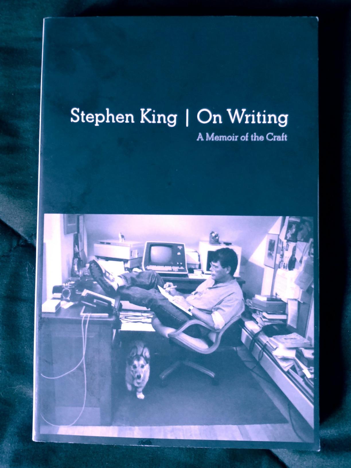
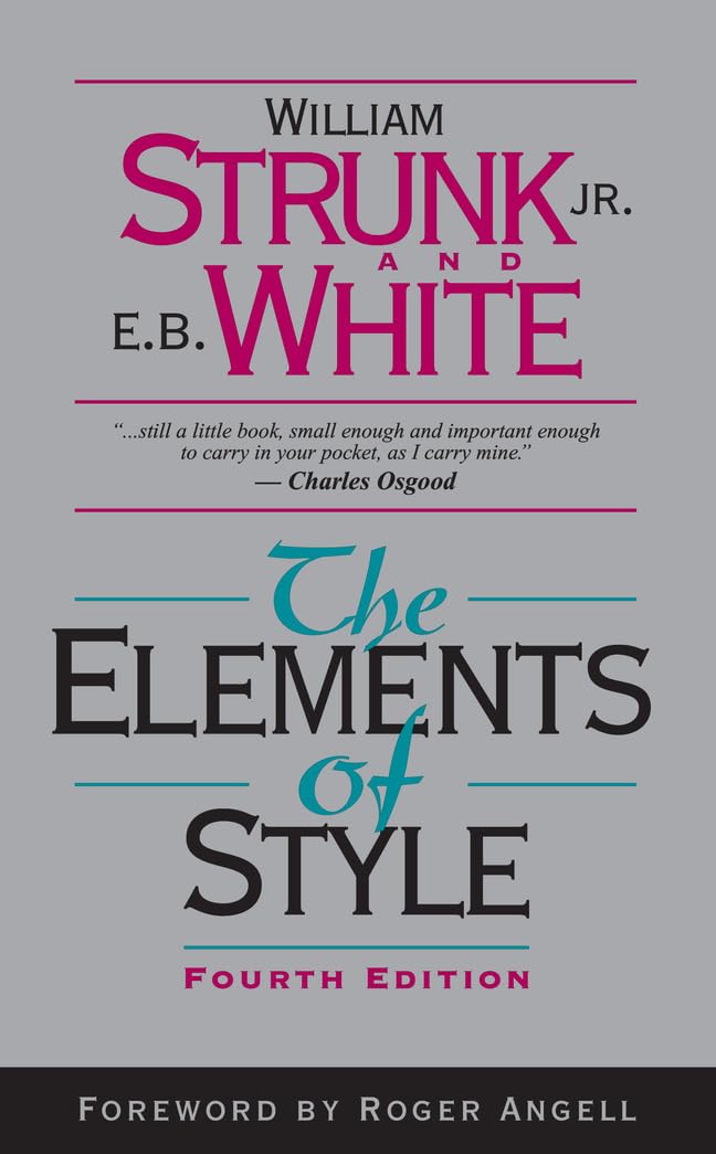
Nonfiction covers fail when they look like novels, and novels fail when they look like textbooks. If the book teaches a skill, the title or subtitle should name the skill in ordinary words. If it is a memoir, the signal can be more personal, but the subtitle should not pretend the book is a manual. Business books that mimic a famous cover’s exact layout are a likeness problem of a different kind. You may use the shelf’s general habits — strong title, limited colors, one image — without tracing a particular book.
Do not signal medical authority you do not have. A white cover and a cross do not make a health book clinical, and they do invite a promise you may not mean. Name the subject accurately. Leave treatment claims out of the art and out of the subtitle. The same restraint applies to money: a chart on the cover is a design element, not evidence.
Use one shelf’s signals, not two
The common AI failure is a collage of signals: a couple, a skyline, a sword, and a worksheet grid. It happens because a vague prompt asks for “professional and exciting.” Your brief should name one shelf. When you review, ask which single signal is doing the work. If you cannot answer, reject the image.
Compare the concept with two real books on the shelf you chose, at thumbnail size, not to copy them but to see whether a shopper could sort yours into the same pile. If they would sort it somewhere else, believe them. Change the signal or change the category. Do not keep both and hope the description mediates. Descriptions are not visible in the grid.
Write the chosen signals into the cover brief as three allowed and three refused. That list is short on purpose. Genre clarity is a refusal skill. The books that are easiest to recognize are rarely the ones wearing every costume at once.